-
Documentation
-
About
- Getting Started & Use Cases
- Support
-
What's New
- Simplified tools for designing with contour lines
- DynamicFlood: Organize and understand your computations
- Modelling stormwater networks in Scalgo Live
- National US high-resolution land cover map
- New functionality for CAD users!
- DynamicFlood: Cleaning up rain events and adding historical rains, now available in France
- National Polish high-resolution land cover map
- DynamicFlood now available in Great Britain
- Global contour maps now available
- Updated Swedish topsoil map
- Scalgo Live Global theme is updated with new elevation and land cover data
- Detailed culvert information in DynamicFlood
- No more Lantmäteriet fees for Swedish data
- Depth-dependent surface roughness (Manning) in DynamicFlood
- Detailed land cover map for all of Great Britain
- National French high-resolution land cover map
- Work with multiple features simultaneously in the canvas
- Spill points on flash flood map and depression map
- New surface roughness (Manning) parameters for DynamicFlood
- Workspace and Modelspace sharing updates
- Regionally varying rain in DynamicFlood Sweden
- Veden imeytyminen nyt osana rankkasadeanalyysejä
- Use Scalgo Live anywhere in the world
- DynamicFlood: Live model speed info and regionally-varying rain events
- Sea-level rise: Download building flooding information
- Detailed contour maps and editable buildings in Workspaces
- New in Modelspaces: Explore hydrodynamic simulations and visualise the dynamics of flow velocity
- National German high-resolution land cover map
- Specify basins and protrusions by drawing their outer boundary
- Simplified path features
- National Norwegian high-resolution land cover map
- Organise and communicate on a digital canvas
- New sidebar to help organize your analyses and queries
- Sliding contours
- Ny skyfallsanalys och en ännu bättre marktäckekarta
- New land cover map for Finland
- Depths in the depression map
- New Danish land cover map with more classes
- National Swedish High-Resolution Impervious Surface Mapping
- Watershed tool updated with even better descriptions of catchment characteristics
- National Flash Flood Map with Infiltration and Drainage for Denmark
- Add your own WMS layers to SCALGO Live
- Enriched building data in Denmark
- National hydrological corrections and Land Cover for Poland
- National hydrological corrections for Norway
- Updated Impervious Surface Mapping for Denmark
- National hydrological corrections and updated local data for Finland
- Fast and intuitive tools to work with infiltration and land use
- Improvements to vector imports and exports
- National Danish groundwater model
- New Sweden high-resolution model
- New powerful depression map and more analyses visualization options
- Introducing Modelspaces: Get your hydrodynamic models into SCALGO Live
- Use case videos
- Access a EA flood maps inside SCALGO Live
- Improved map export
- New powerful ways to edit the elevation model
- Better coloring of flooding layers and sea-level depth filtering
- National Danish High-Resolution Impervious Surface Mapping
- National access for local and regional organizations
- Simpler, more powerful downloads
- Customize Layer Transparency
- Hydrological corrections and new data in Sweden
- Improved export functionality
- Access a wide range of authorative data inside SCALGO Live
- Importing VASP data
- Measure gradients, undo edits, and Norway updates
- New terrain edit features, soil balance information and much more...
- Browse historical orthophotos in SCALGO Live
- Emergency planning with sea-level rise from national forecast data
- Detailed information about watershed composition
- Better styling of imported vector layers
- New Danish Elevation Model
- Work with gradients in the profile widget
- Flood risk screening from rivers and flow paths
- New workspace tool: Raise and lower terrain uniformly
- Importing LandXML TINs, LAS point clouds
- New model in Sweden
- Side slopes on workspace features
- Drag and drop enhancements
- Swedish contour maps
- Subsurface basins and sewage drains in workspaces
- New Interface
- Volume information for watersheds and flow paths
- New powerful tool for emergency response and coastal flood prevention
- Denmark: New flash flood map
- Sweden: Geodatasamverkan setting for Swedish users
- Import custom terrain models
- New Hydrological Corrections
- Elevation contours now available
- Download orthophotos as JPEG and PNG
- Subsurface structures in workspace
- Sea-levels in terrain profiles
- Updated orthophotos
- Models and analysis update
- User interface updates
- User interface updates
- GeoDanmark/FOT data, Matrikelkortet now available
- New flash flood map
- Download of risk polygons
- Updated orthophotos
- Nationwide hydrology on the new DHM/2015 model now available
- New flash flood map computation available with watershed download
- DHM/2015 variants and sea-levels now available nationwide
- DHM/2015 now available nationwide
- Hydrology on the new DHM/2015 model now available
- New DHM/2015 Model - now with buildings
- New DHM Model
- Watershed Tool
- Ad hoc layers
- Nationwide contour maps for all countries
- Single Sign-On
- Data Fees
- User Interface
- Canvas
- Analysis
- Workspaces
- Modelspaces
- Working with CAD data
- Core+ DynamicFlood
- Core+ NatureInsight
- Core+ PropertyResilience
- Streams and Flow
- Physical Properties
- Country Specific
-
About
What's New – New powerful depression map and more analyses visualization options
Mar 29, 2021
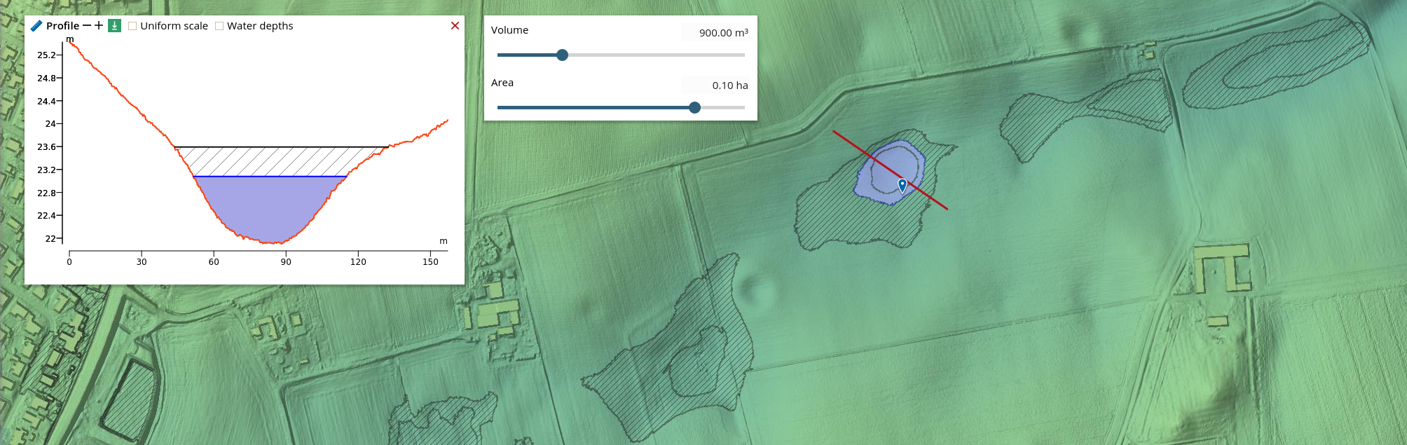
SCALGO Live's depression map allows you to investigate the depressions in the terrain and has just become much more powerful. You can now use new volume and area sliders to hide small depressions and focus on the bigger ones. Furthermore, the default rendering style has been changed to a hatched pattern that makes it easier to distinguish between inside and outside of a depression.
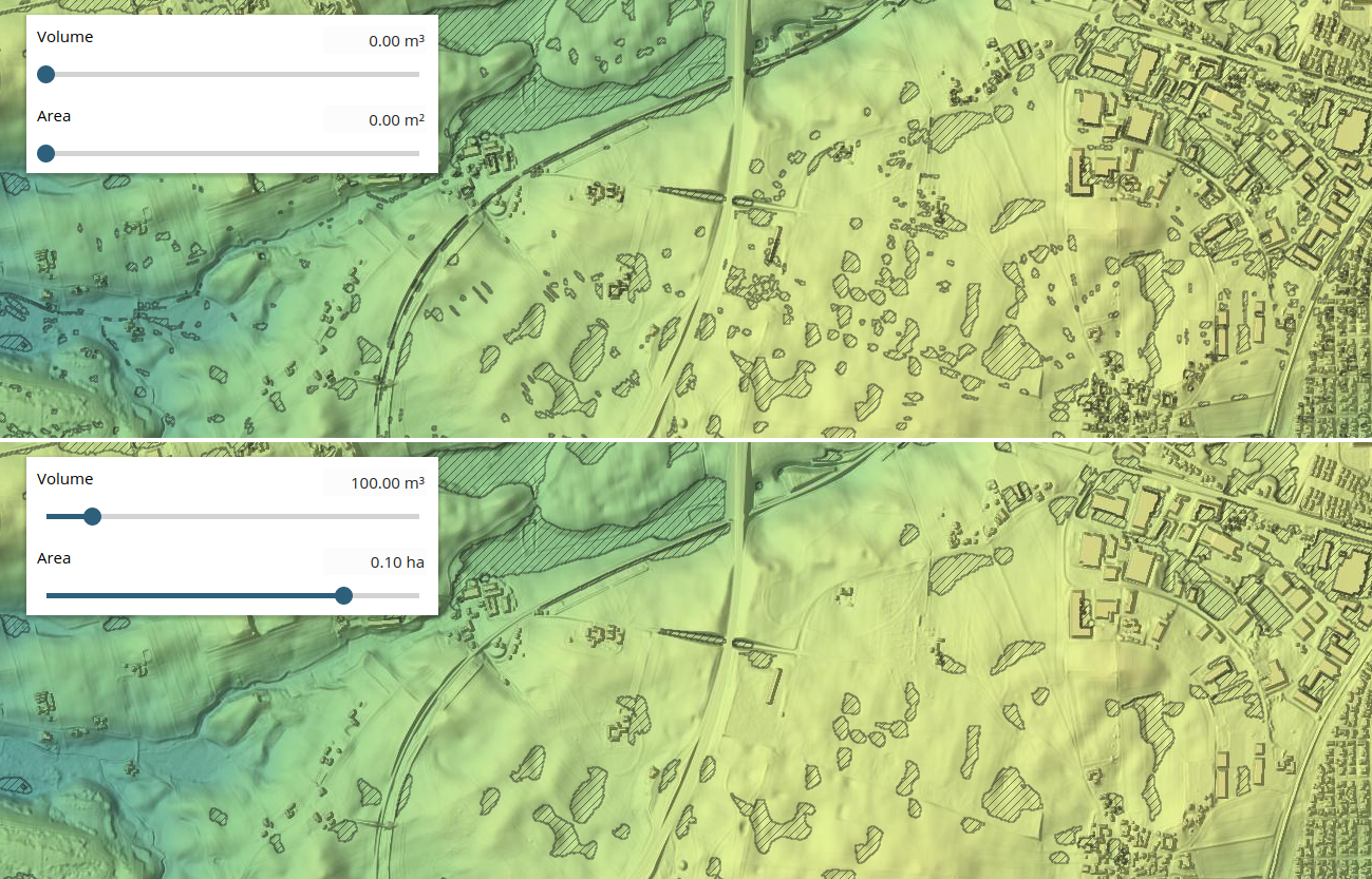
But that's not all, several other interesting features have been added to the depression map:
- On point queries you now get the area of the maximal depression and the area of the selected region as well.
- You can download the map as both an area and volume raster, and as depression polygons annotated with area and volume.
- The profile tool now shows depressions too.
- A banded rendering style is now supported - more on that below. You can use either volume or area to define the bands.
- We now support volume and area contours, allowing you to easily find areas in a depression with a particular capacity.
Some of these features are shown here:
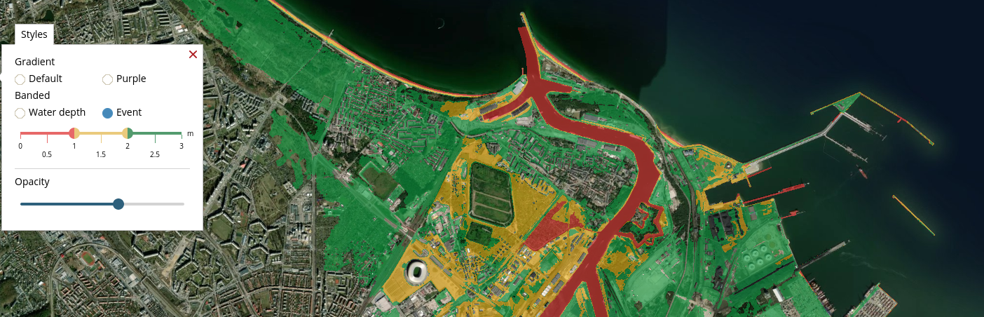
Banded styles for all analyses
We now support banded rendering styles for all analysis layers. Banded rendering allows you to color the analysis layers in three color bands defined by two threshold values on water depth or event. Previously this was possible only for the flash flood map. Furthermore we have tweaked the colour palette to get a nicer looking output. We have also created a colorful slider to help you set the right threshold values.